Skip to main contentA bar chart compares values across multiple categories.
Metric Calculations
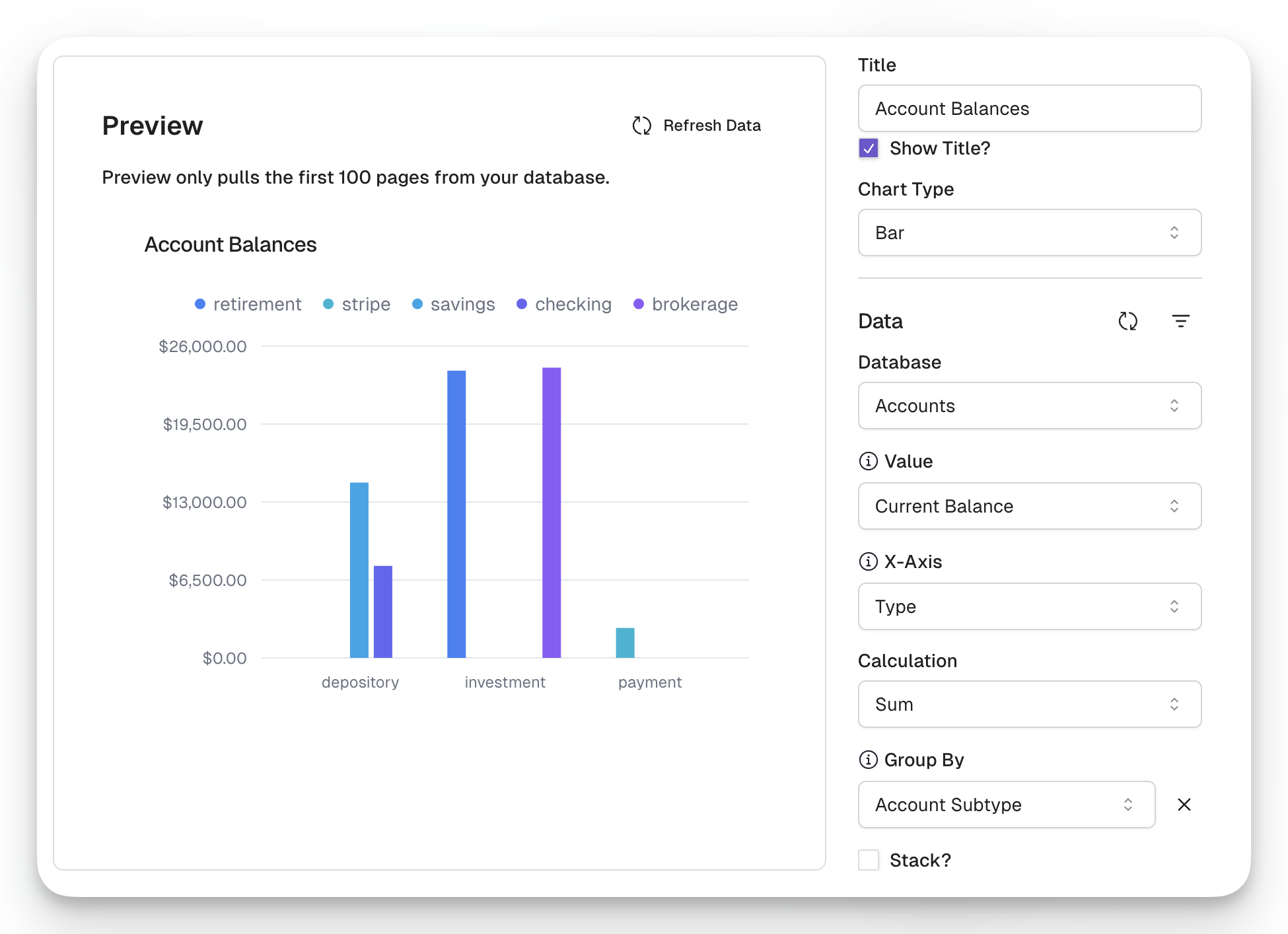
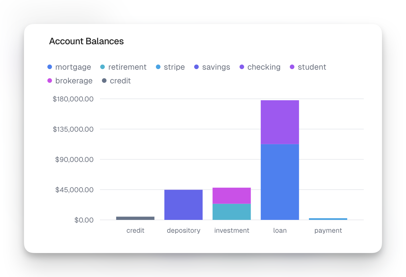
Bar segments can be made up of the sum, average, maximum, or mininum of values within a specified column.
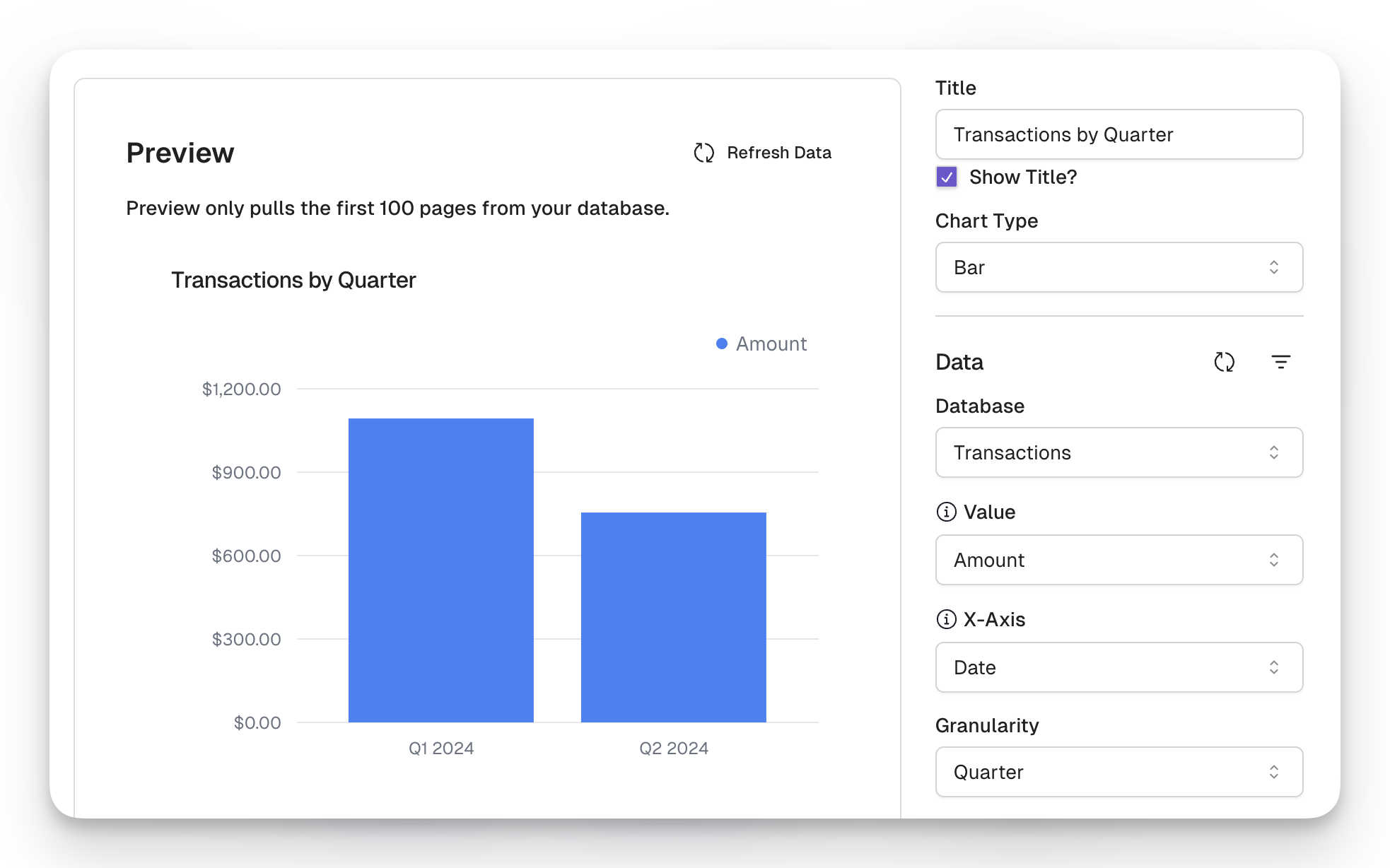
X-Axis
Values within a bar chart are grouped by the x-axis. When creating a bar chart, you’ll need to select which field you want to use for the x-axis.
If you select a date field, you can opt to group by the day, week, month, quarter, or year.
Categories
Additionally, you can group values within a bar. These groups can be shown side by side or stacked.